The user experience, or UX, is a new term for a requirement that is as old as digital projects themselves: creating the best environment for users to read information. This has since developed into a critical requirement due to the boom in use of mobile devices and content distribution on other more recent supports, such as smartwatches. This has implications not only on the editorial front, but also in terms of advertising.
In fact, much of the turmoil seen in the IT market has its origins in the failure of some media to optimize their user experience, with a tendency to offer content alongside invasive advertising or in a nonsensical format for readers. Platforms such as Facebook seized on this opportunity to secure a majority of mobile advertising revenue. Any operator hoping to compete in today’s market, whether in editorial content or services, must provide a great user interface ready for smartphones and mobile devices.
Below are some tips to ensure a successful interface:
Infinite scroll vs. pagination
This is the eternal debate in the modern mobile era. Should a website or application use an infinite scroll system, very common on social networks such as Facebook and Twitter, or should they opt for a more traditional option such as pagination, which is frequently used for desktop navigation? Each approach has its pros and cons. Here are some examples:
● The most effective means of mobile navigation is using scroll, thus avoiding the clicking that is required with pagination. In the desktop user experience scrolling demands that readers move content via the mouse wheel. But this is not the case on smartphones and tablets. Content is moved up or down with the swipe of a finger. A more intuitive user interface.
● Use of resources: this may seem a secondary concern, but it certainly isn’t. Pages and applications that use infinite scroll, particularly those that contain many images, use far more resources (data and battery) than digital products based on pagination. This is well worth keeping in mind when choosing the best option for your product.
● Searching for and locating content: infinite scroll is an attractive navigation system when you want users to reveal content gradually. The scroll option is perfect for social networks such as Facebook or Twitter, with the way information is read making it practically mandatory. The problem is that users may get lost. Thus, when attempting to return to a specific place they find that they have to scroll up or down through content that they have already viewed. A pagination system makes it easier to search for and locate content.

The same example is always used to demonstrate the pros and cons of scroll compared to pagination: Google uses a pagination system to display and sort results, but opts for infinite scroll on its Google Images service, where it is more practical for images to load automatically as the user scrolls down.
Bottom navigation bar
This is vital in application development for a number of reasons:
● A study from February 2013 called ‘How Do Users Really Hold Mobile Devices?’, by Steven Hoober, found that 49% of people navigate on mobile devices using just one hand. Furthermore, 90% of users hold their smartphones vertically, compared to just 10% in the horizontal position. In terms of user experience, a navigation bar located at the top of an app presents an obvious problem. Which is why the majority of apps now position the navigation bar at the bottom.

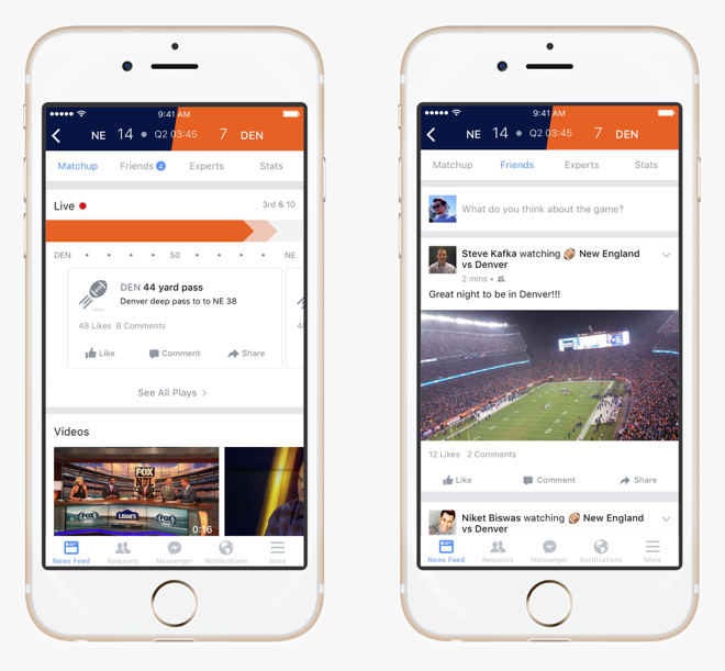
● Often the only real reference point that users have when navigating through pages or discovering content via infinite scroll is the bottom bar, where highly distinctive icons allow them to move quickly from one space to another.
Tutorials are not always a good idea
Some mobile applications open tutorials when a user first lands on the product. Rather than being a help, such tutorials may drive users away from an app. Users tend to want to try out a product as soon as they download it, whether it be a video application, a price comparison tool or search for services. Tutorials do not mean more users and more registrations.
In fact, when discussing usability we often mention the concept of the “invisible hand”. A user interface that offers the right experience shouldn’t need a guide because the navigation experience will be entirely intuitive. This is achieved by providing menu bars with the same icons to help prevent users from getting lost, while hiding the bar when the reader browses vertically through the content or using a brief fade to black to change displays (more efficient than lateral movements).
Your registration form may be a problem
Registration can drive rapid disaffection with an application. It is a mistake to ask users to register before they get the chance to try out an app or product and decide whether they like it. Furthermore, bear in mind that the funnel and information required to register for a service are key to ensuring that an application is a success among users.

How to design the registration process:
● Sometimes designers make the mistake of placing the registration and login buttons together in the same navigation bar. This is a usability flaw. Users tend to confuse the two concepts and find it frustrating to have to leave the registration page to find the login option, or vice versa.
● Registration and login must be completely distinct. Twitter is an example.


● Make registration easier by logging into popular networks, such as Facebook, Twitter and email accounts such as Gmail.
● Use an email or telephone number to login.
● Keep users that have just registered logged on.
● Warn when passwords are case sensitive.
● When logging in, give users the option to view their passwords to avoid errors.
Follow us on @BBVAAPIMarket

