R and Python are the two languages from a data science standpoint. They are commonly used for statistical calculation and graphical display of data to draw conclusions and make decisions. R, although still a very common syntax, is gradually losing ground to Python, a commonly-used language that has a more-accessible learning curve than the R language, especially for programmers who have mastered syntax such as C, C++ or Java.
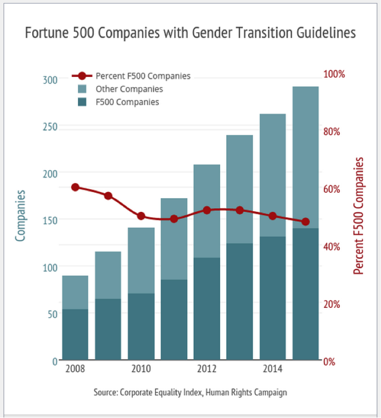
Thanks to the explosion in the use of data in companies and the convenience offered by Python, the professional growth of this language is still enormous:
Python is an interesting language not only to display data but also for its ability to automate processes, extract data or use it in machine learning. With Python we can change large data sets through simple programming, simplify the use of APIs to capture data with its Requests library and extract information with NumPy, scipy, scikit-learn and pandas.
More and more data display libraries
Although Python is used for almost all fields that include data science, libraries designed to display data is one of its key features. They are growing in number and this is intended to be a list of the most important ones:
1.matplotlib
Area charts, histograms, line displays, bar charts and scatter diagrams — matplotlib is one of the most-used Python libraries in data science. Much of its success is the ease that it gives developers when designing displays with data from very few lines of code and then these graphics can be included in any web project.
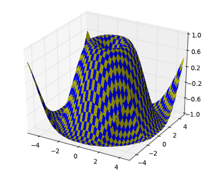
With matplotlib you can also create displays with maps (in this case it is necessary to also use Basemap) and in 3D (mplot3D, a toolkit that adds design features in 3D to matplotlib, with the possibility to rotate the figure and even zoom in on the display itself).

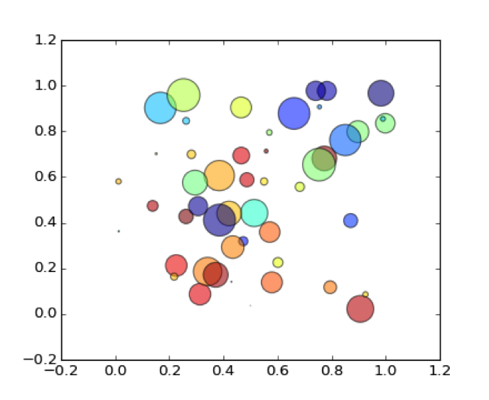
To demonstrate the tremendous efficiency in using the code to create displays with matplotlib, here is a scatter plot as an example:

“””
Simple demo of a scatter plot.
“””
import numpy as np
import matplotlib.pyplot as plt
N = 50
x = np.random.rand(N)
y = np.random.rand(N)
colors = np.random.rand(N)
area = np.pi * (15 * np.random.rand(N))**2 # 0 to 15 point radiuses
plt.scatter(x, y, s=area, c=colors, alpha=0.5)
plt.show()
2. Seaborn
Seaborn is a data display library in Python based on matplotlib. The idea of Seaborn is that data scientists have an interface to create attractive and explanatory statistical graphs: the goal is to display complex data easily and draw conclusions. These are the main features:
– It has several integrated themes to improve the design of matplotlib.
– It provides tools for choosing the color palette.
– Functions to compare data subsets.
– Tools to adapt and view linear regression models.
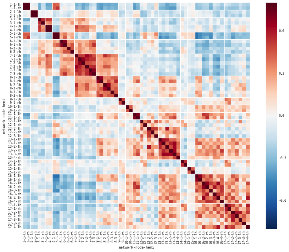
– Functions to display data matrices.
– Use of clustering algorithms.
– Possibility of establishing time series statistics with the data.

3. Bokeh
The aim of Bokeh is to offer elegant, attractive and simple graphics in the style of the JavaScript D3.js library, while also providing a high level of interactivity with large volumes of data. It is an interesting option if you want to create graphic displays, data applications or dashboards.
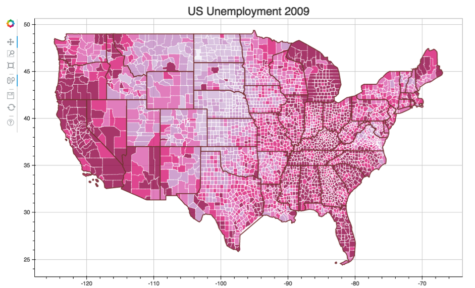
Any kind of displays can be done with Bokeh, focused mainly for modern browsers: choropleth maps, heat maps, line graphs, area charts, bar charts, among others. There are many different possibilities, depending on the data and the most appropriate display in each case:

Bokeh has tutorials for developers or data scientists who want to start working with the library, from basic exercises to specific training for each type of chart or also more advanced training.
4. Pygal
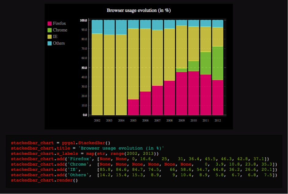
Pygal is primarily used for creating graphics in SVG format, which is common for creating interactive displays for digital projects. It also makes it possible to download graphics in image format, specifically in .png, but the dependencies that allow it must be installed.
All types of displays can be created: bar charts, line graphs, pie charts, funnel plots and also all kinds of displays with maps.

5. Plotly
Plotly is a little different from other tools: it is an online library for data analysis and display. It has very complete documentation, with extremely accessible tutorials, not only to do all sorts of graphics from designs served by matplotlib, but also directly with the API.
The API makes it possible to handle data to create graphics which can then be downloaded as an image or embedded in a website through a code. To install the API in Python pip can be used. Any user who needs to work with the API should follow the steps in the documentation.
Some of its features include:
– The user can import data to Plotly from Google Drive, Dropbox or database management services such as MySQL, PostgreSQL, Spark SQL or Oracle for displaying information. Data can be downloaded to Excel.
– Each graphic can be exported in .png, PDF, SVG and EPS formats, with the width and height of the display being able to be chosen.
– We can create all kinds of displays with Plotly: from bar charts to line graphs, area charts, histograms, bubble diagrams, heat maps and so on.
– Most of the graphics include open access for Plotly users. Any user who registers will have unlimited storage for their public displays. This allows other users of the service to make comparisons and use the existing graphics as an example to adapt their data to these displays.
– The free version also makes it possible to host displays of a private nature, but there are space constraints here. This option prevents other users from accessing the private data in a graphic.

Follow us on @BBVAAPIMarket


